
Efforts to Enhance ldentifiability
The Ministry of Finance, the Bank of Japan, and the National Printing Bureau are making efforts to make banknotes easier to use for people who are visually impaired.
We are working on future design changes to banknotes (timing of the design changes is yet to be determined) to enhance the ease with which people who are visually impaired can tell the difference between banknotes. We continue to listen to the feedbacks of a variety of interested parties, gather information on what is being done in other countries, and review the issue from many different perspectives.
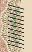
Tactile marks
The tactile mark, shaped with 11 diagonal lines for excellent finger sensitivity, is differently positioned to facilitate easy identification of denominations.Textured marks are made with deep intaglio printing.
 Series-F 10,000 yen note
 Series-F 5,000 yen note
 Series-F 1,000 yen note
 Series-D 2,000 yen note
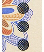
Banknote identification app “U・Qui・Ch-kun” (available only in Japan)

As part of our efforts to provide those who are visually impaired with a means to identify the difference between Bank of Japan notes, the National Printing Bureau released “U・Qui・Ch-kun,” an app for identifying banknotes (for iPhone). The app was released on December 3, 2013 (Heisei 25), and is available for download free of charge.